Sunday, 19 December 2010

Analysis of Double Page Spread

This double page spread is one from Kerrang magazine, with 30 Seconds To Mars. The interview is about their newest record "This Is War" and the law suit with 'Virgin Records.' The content of the interview links in with the colours used as the black and purple can be showing the dark time that they went through when battling the law suit, which was unjustly set upon them. 
The shots used of them are mid-shots, and they are all making eye contact, building a relationship with the reader, despite the fact that the band look quite dangerous; particularly with Jared's pose of his jacket over his shoulder, making the band seem 'badass' and powerful, linking to the surface meaning of the album title "This Is War" as 30 Seconds To Mars are obviously not promoting war itself.
The timeline at the side of the line is effective for the reader, despite the fact that it includes a couple of pictures from things that Jared Leto has starred in such as "Requiem for a Dream" which is in a way a positive thing as it has a wider range of content but may be a negative thing as it may appear to focus on Jared Leto, rather than the band as a whole.
The interview includes taboo terms such as in the plug when it quotes Jared saying "There were many, many fucking brutal days." This may indicate that the magazine's target audience is not a younger one, as there is older content included. 
The interrogatives from the interviewer are generally those which people who love 30 Seconds To Mars would want to know and are structured like this, appealing to the reader as it is as though they are answering them. The language used is laid back and partially informal but intellectual and there are a range of sentences included.
Classic Rock. There is just one image one this double page spread which takes up the entire left page and almost a third of the next page, but despite the image being very large, it doesn’t affect the writing. Because of the large image, the double page spread mostly consists of this with just a couple of columns for text.
The colour palette used is black and white; the band are dressed in dark colours which, along with the headline in bold black, greatly contrasts with the white background and makes the magazine more neat and simple. The colours used also could link to the title of the magazine "Classic Rock" as black and white are generally quite calm and characteristic when used together.
Adding to the simplicity is the short and clear headline of "Fiends Reunited", this is a play on words and contrast of the usual "Friends Reunited", making the band seem darker and dangerous. The font also stays pretty much the same on the entire double page spread, which makes it easier to read.
The register and tone of this interview is also very laidback and informal, linking to the genre and content of the magazine, and certain things suggest that the magazine is aimed at an older audience. For example smoking is mentioned and the language isn't seen as suitable for younger people.

Analysis of Contents

Kerrang. The pictures that they have used indicate that these are the best pages in the magazine and so the readers will be attracted to those particular pages.
The editor is shown above the largest picture on the page, and next to where it says "Contents" which would pull the target audience's eye toward this part and make them feel as though they are closer to whoever wrote it.
The largest photo is a close up of Craig Owens; being the focus of the page and perhaps will draw more girls in as he is a good looking man. The fact that you can see a close up of the tattoo on his neck may have connotations of danger and rebellion, which links to the colours used in the title and subtitles as the yellow and black connote danger and warning.
One of the subtitles saying "K Icons!" is suggestive of the reader being a regular buyer of Kerrang, therefore knowing the magazine well.


Mojo. The title of the magazine is the biggest font, making the reader focus on the page. The background of the contents page is quite busy, but is overlapped by the plain white background for the information of the contents, therefore contrasting backgrounds and pulling the target audience in.
Like with Kerrang, Mojo includes pictures of certain pages, suggesting that they are the best ones that they should read. The bands that they have included to put in the pictures are also different to each other, attracting a wider range of audience.
The list of artists who will be featured in this particular issue of Mojo is in the centre of the page with the subtitle in bold, to make clear what the issue will consist of and attract a fan of any of the artists listed. 

Wednesday, 15 December 2010

Analysis of Magazine Covers

Kerrang is a magazine edited by Nichola Browne, first publicised in 1981, originally as a 'one-time supplement.' It is so-titled due to its onomatopoeic name meaning, linking to music. The issues are generally priced £2.20, the price is then raised by a short amount for special editions. "Life Is Loud" is Kerrang's regular tagline, which relates to what sort of music is going to be in the magazine.
The magazine cover always features a plug titled "Plus!" section showing who else will be in that weeks issue of the magazine, in order to entice people to buy the magazine who may not like the artist on the front. Kerrang's audience is a wide one, ranging from teenagers to older adults.
Also usually included are posters, this particular one includes Linkin Park and Avenged Sevenfold- people will then be attracted to the magazine who like these bands.
The main colour palette used by Kerrang are black, white, yellow/red, which change sometimes in order to go with what image is on the front. The colours are well-suited to the genre of magazine that Kerrang is; rock, metal, punk and pop/punk sometimes.
The cover lines of this issue are things such as "Guess who's back" which arouses curiosity, making the reader want to buy the magazine to find out who is 'back.'
The puff of this issue is "Nice Planet. We'll Take It," as the band on the front is 30 Seconds To Mars- this is a play on words, linking to the content and in reference to the band's name which is the biggest font on the cover, creating dominance, drawing attention and appealing its audience. 30 Seconds To Mars are also making eye contact and Tomo (the one on the right) has a slight smile on his face, which would bring the audience in as it is welcoming. They are also on the same level and are wearing clothes the same/similar colour but not matching, indicating that they are unified and have a close relationship. The barcode, is on the bottom right, as usual. 

AP (Alternative Press) magazine is an American based music magazine, originally a 'fanzine' distributed at concerts in 1985, this was then made into a magazine because the founder believed that all genres of music deserved media coverage. The covers early on included bands such as Red Hot Chili Peppers and Beastie Boys as AP is an alternative rock magazine.
The frequency is monthly and AP is generally sold at a price from $8.76.
The main colour palette is red, yellow, orange and grey, depending on the cover image. The Used are on the front of this issue, with "Used" being the biggest font on the cover, so that it stands out and encourages the audience to purchase the magazine. They are all evenly lined up on the cover and are all making eye-contact, bringing the audience in and Quinn (far left) is touching Dan's shoulder who is touching Bert's and so on, and from the contact the audience can infer that their relationship is close.
Like Kerrang, the plug at the bottom of the cover shows who else will be in the magazine- such as Sum 41 and Good Charlotte- to make anyone who may like these bands, but is not necessarily a fan of the cover artist want to buy the magazine.
The bar code of this magazine is also located in the bottom as when you read something, the last thing that you look at is potentially on the bottom right. 

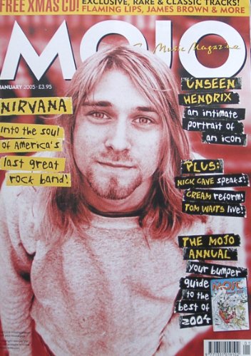
Mojo is a music magazine, generally with the classic rock genre, produced in the United Kingdom monthly for around £3.95. The first issue was in 1993 which was initially published by Emap, later to move to Bauer. It started off featuring artists such as Bob Dylan, John Lennon, The Velvet Underground, Sex Pistols and The Beatles.
In recent years, Mojo has been known for publishing "Top 100" lists, such as "The Top 100 Records That Changed the World," and including a 'covermount' CD which would attract a wide audience due to the fact that people would buy it purely for the CD, if nothing else. This issue has a free Christmas CD which they have chosen to use as the cover line, again to make more people buy it for the free CD, even if they are not a fan of anything featured in the magazine.
The cover of the issue that I have chosen to analyse features a picture of Kurt Cobain of Nirvana, as Mojo often releases issues of older artists, not just new and still around ones. The picture chosen to put on the cover is quite innocent as it makes Kurt Cobain look like a small character, therefore making him look approachable and welcomes the audience. This and the fact that he is making eye contact, entices the audience to buy the magazine.
The font is usually bold, inviting and clear but this issue changed it for a more Nirvana look as it is still clear but busy and not nearly as crisp.
The cover line "Into the soul of America's last great rock band" gives off the impression that Mojo will be revealing some sort of secret, therefore making people want to know all about it, and make fans of Nirvana feel as though they don't yet know all; until they buy it and all will supposedly be revealed.
The plug on the right hand side shows what will be included in this particular issue if the viewers somehow were not a fan of Nirvana and/or Kurt Cobain, and so readers will be able to get a peek of what else there will be, therefore attracting more people to buy the magazine.